What Is a Scatter Plot in Matplotlib?
A scatter plot is a chart used to display individual data points on a graph.
It helps visualize the relationship, correlation, or distribution between two variables.
Scatter plots are commonly used in data science, statistics, and machine learning to identify trends and patterns.
Basic Scatter Plot Example
Python
import matplotlib.pyplot as plt x = [1, 2, 3, 4, 5] y = [2, 4, 1, 8, 7] plt.scatter(x, y) plt.show() 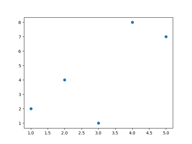
Changing Marker Style
Python
import matplotlib.pyplot as plt x = [1, 2, 3, 4, 5] y = [2, 4, 1, 8, 7] plt.scatter(x, y, marker="^") plt.show() # Output: # Scatter plot with triangle markers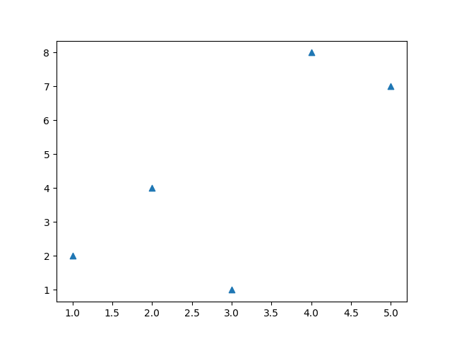
Changing Color
Python
import matplotlib.pyplot as plt x = [1, 2, 3, 4, 5] y = [2, 4, 1, 8, 7] plt.scatter(x, y, color="red") plt.show() # Output: # Scatter plot with red points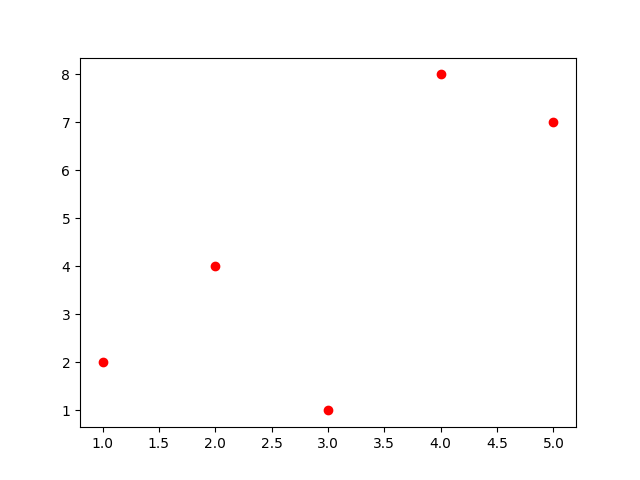
Multiple Colors Using List
Python
import matplotlib.pyplot as plt x = [1, 2, 3, 4, 5] y = [2, 4, 1, 8, 7] colors = ["red", "blue", "green", "purple", "orange"] plt.scatter(x, y, c=colors) plt.show() # Output: # Scatter plot with different colored points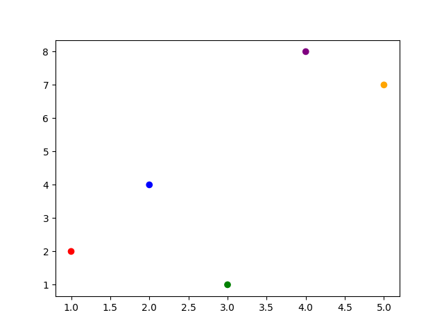
Adding Labels and Title
Python
import matplotlib.pyplot as plt x = [1, 2, 3, 4, 5] y = [2, 4, 1, 8, 7] plt.scatter(x, y) plt.title("Student Scores") plt.xlabel("Hours Studied") plt.ylabel("Marks") plt.show() # Output: # Scatter plot with labels and title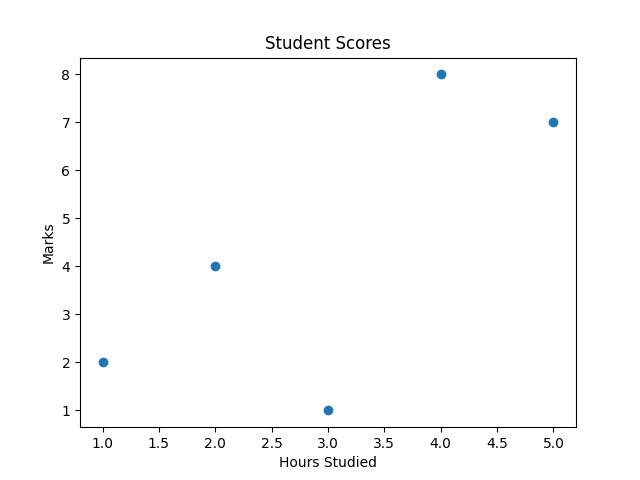
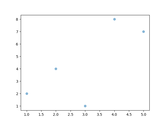
Scatter Plot with Transparency
Python
import matplotlib.pyplot as plt x = [1, 2, 3, 4, 5] y = [2, 4, 1, 8, 7] plt.scatter(x, y, alpha=0.5) plt.show() # Output: # Semi-transparent pointsalpha controls opacity.
Comparing Two Datasets
Python
import matplotlib.pyplot as plt x1 = [1,2,3,4] y1 = [4,3,2,1] x2 = [1,2,3,4] y2 = [1,2,3,4] plt.scatter(x1, y1, color="red") plt.scatter(x2, y2, color="blue") plt.show() # Output: # Two colored scatter datasets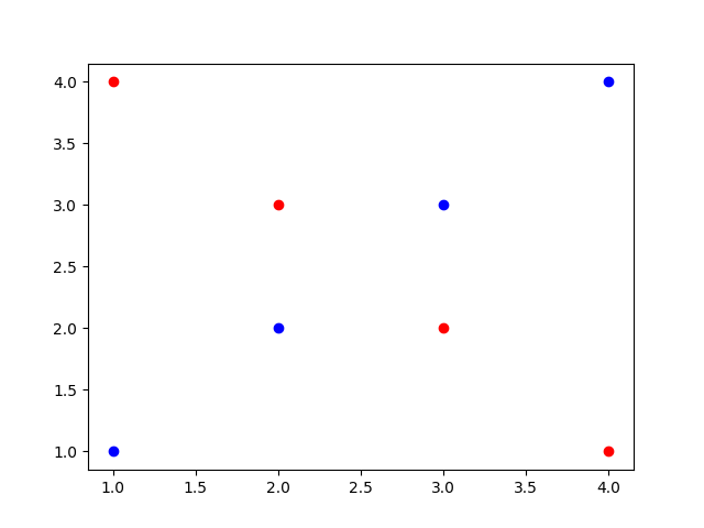
Key Points to Remember
-
Scatter plots show relationships between variables.
-
Use
plt.scatter()to create them. -
Customize with
marker,color,s, andalpha. -
Useful for correlation and trend analysis.