What Are Labels in Matplotlib?
Labels in Matplotlib are used to describe the chart and its axes so that viewers can easily understand the data being displayed.
Labels improve readability, clarity, and professionalism of visualizations.
There are three main types of labels:
-
Title – overall heading of the chart
-
X-Axis Label – describes horizontal data
-
Y-Axis Label – describes vertical data
Basic Example with Labels
Python
import matplotlib.pyplot as plt x = [1, 2, 3, 4] y = [10, 20, 15, 25] plt.plot(x, y) plt.title("Sales Chart") plt.xlabel("Months") plt.ylabel("Revenue") plt.show() # Output: # Line chart with title and axis labels 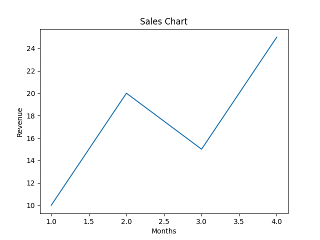
Functions Used for Labels
| Function | Purpose |
|---|---|
plt.title() | Sets the chart title |
plt.xlabel() | Labels the X-axis |
plt.ylabel() | Labels the Y-axis |
Changing Font Size and Style
Python
import matplotlib.pyplot as plt x = [1, 2, 3, 4] y = [10, 20, 15, 25] plt.plot(x, y) plt.title("Sales Chart", fontsize=18) plt.xlabel("Months", fontsize=12) plt.ylabel("Revenue", fontsize=12) plt.show() # Output: # Chart with larger and clearer text 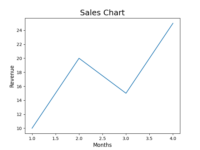
Changing Label Colors
Python
import matplotlib.pyplot as plt x = [1, 2, 3, 4] y = [10, 20, 15, 25] plt.plot(x, y) plt.title("Sales Chart", color="blue") plt.xlabel("Months", color="green") plt.ylabel("Revenue", color="red") plt.show() # Output: # Chart with colored labels 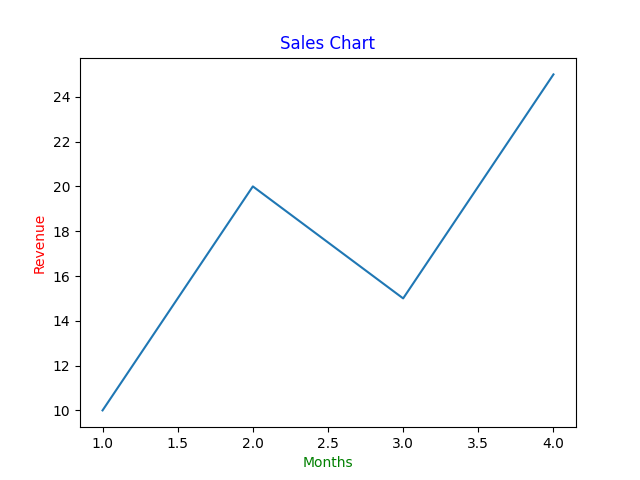
Using Bold and Italic Styles
Python
import matplotlib.pyplot as plt x = [1, 2, 3, 4] y = [10, 20, 15, 25] plt.plot(x, y) plt.title("Sales Chart", fontweight="bold") plt.xlabel("Months", style="italic") plt.ylabel("Revenue", style="italic") plt.show() # Output: # Styled text labels 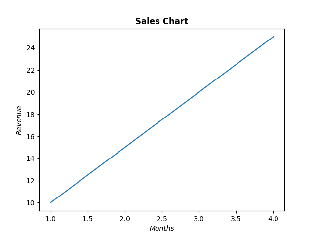
Adding Padding for Better Spacing
Python
import matplotlib.pyplot as plt x = [1, 2, 3, 4] y = [10, 20, 15, 25] plt.plot(x, y) plt.title("Sales Chart", pad=20) plt.xlabel("Months", labelpad=10) plt.ylabel("Revenue", labelpad=10) plt.show() # Output: # Labels positioned with extra spacing 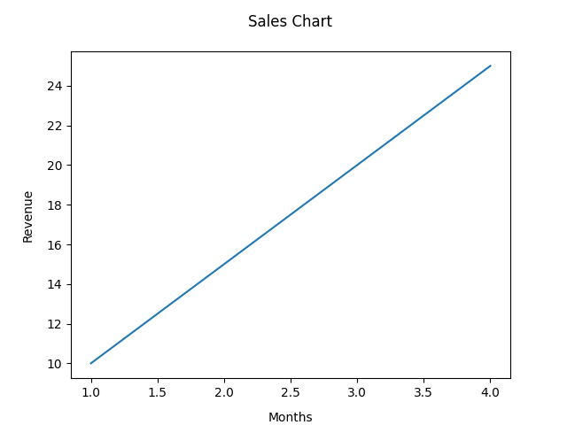
Why Labels Are Important
-
Help viewers understand the data quickly
-
Improve presentation quality
-
Make charts self-explanatory
-
Essential for reports and dashboards