What Is a Histogram in Matplotlib?
A histogram is a chart used to show the distribution of numerical data.
Instead of comparing categories like a bar chart, a histogram groups numbers into intervals called bins and displays how many values fall into each bin.
Histograms are widely used in statistics, data science, and analytics to understand data patterns such as spread, skewness, and frequency.
Basic Histogram Example
Python
import matplotlib.pyplot as plt data = [1,2,2,3,3,3,4,4,5,5,5,6] plt.hist(data) plt.show() # Output: # Histogram showing frequency distribution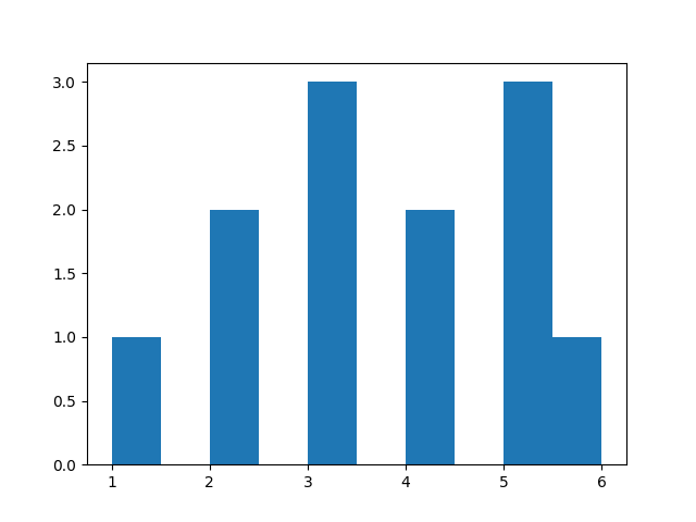
Changing Number of Bins
Python
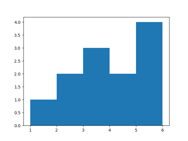
import matplotlib.pyplot as plt data = [1,2,2,3,3,3,4,4,5,5,5,6] plt.hist(data, bins=5) plt.show() # Output: # Histogram with 5 bins-
More bins → detailed view
-
Fewer bins → broader grouping
Changing Color
Python
import matplotlib.pyplot as plt data = [1,2,2,3,3,3,4,4,5,5,5,6] plt.hist(data, color="green") plt.show() # Output: # Green colored histogram bars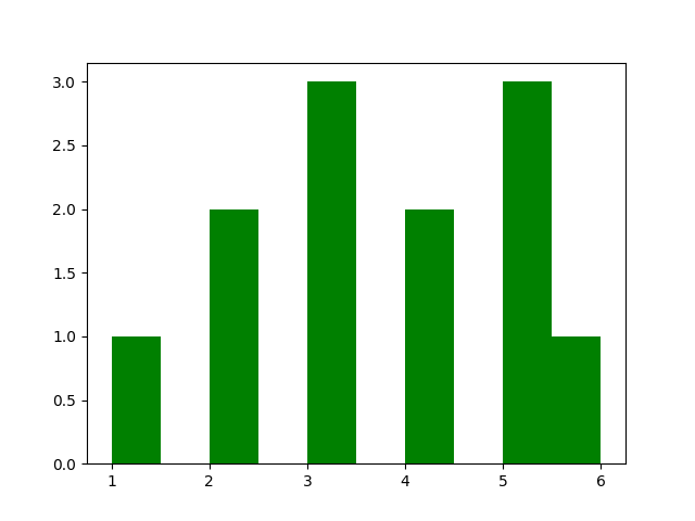
Adding Border to Bars
Python
import matplotlib.pyplot as plt data = [1,2,2,3,3,3,4,4,5,5,5,6] plt.hist(data, edgecolor="black") plt.show() # Output: # Histogram with black borders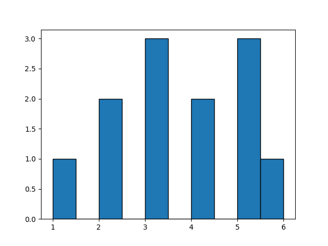
Setting Data Range
Python
import matplotlib.pyplot as plt data = [1,2,2,3,3,3,4,4,5,5,5,6] plt.hist(data, range=(1, 6)) plt.show() # Output: # Histogram limited to selected range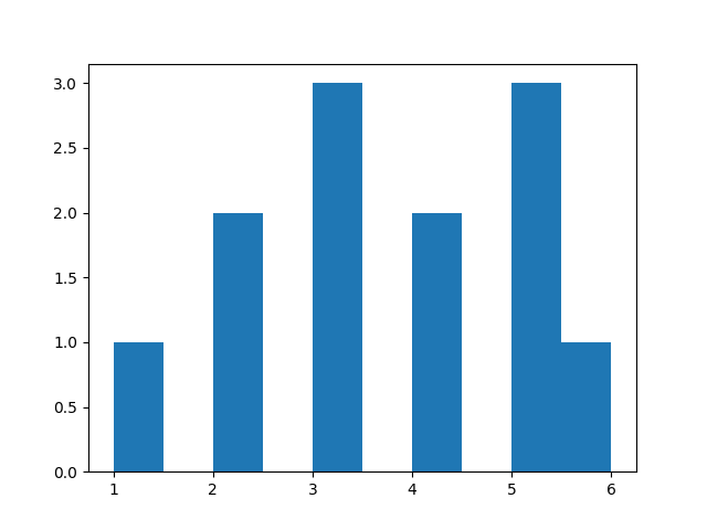
Multiple Histograms Together
Python
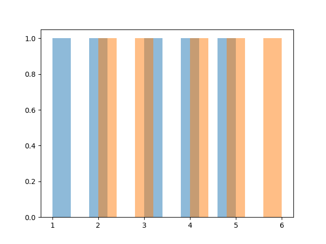
import matplotlib.pyplot as plt data1 = [1,2,3,4,5] data2 = [2,3,4,5,6] plt.hist(data1, alpha=0.5) plt.hist(data2, alpha=0.5) plt.show() # Output: # Two overlapping histogramsalpha controls transparency.