What Is a Pie Chart in Matplotlib?
A pie chart is a circular chart divided into slices, where each slice represents a proportion or percentage of the total data.
Pie charts are useful when you want to show how parts contribute to a whole.
They are commonly used in business reports, surveys, and statistics.
Basic Pie Chart Example
Python
import matplotlib.pyplot as plt values = [40, 30, 20, 10] plt.pie(values) plt.show() # Output: # Circular pie chart divided into four slices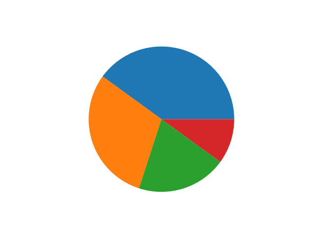
Displaying Percentages
Python
import matplotlib.pyplot as plt values = [40, 30, 20, 10] labels = ["A", "B", "C", "D"]plt.pie(values, labels=labels, autopct="%1.1f%%") plt.show() # Output: # Pie chart with percentage values
-
%1.1f%%shows one decimal percentage.

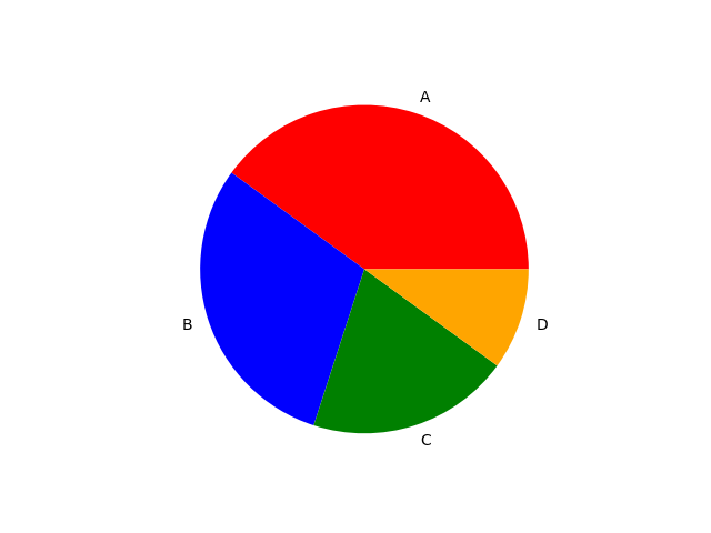
Changing Colors
Python
import matplotlib.pyplot as plt values = [40, 30, 20, 10]labels = ["A", "B", "C", "D"]colors = ["red", "blue", "green", "orange"] plt.pie(values, labels=labels, colors=colors) plt.show() # Output: # Pie chart with custom colors
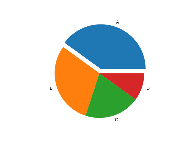
Explode Effect (Highlight Slice)
Python
import matplotlib.pyplot as plt values = [40, 30, 20, 10]labels = ["A", "B", "C", "D"]explode = [0.1, 0, 0, 0] plt.pie(values, labels=labels, explode=explode) plt.show() # Output: # First slice slightly separated from the pie
This emphasizes a particular category.
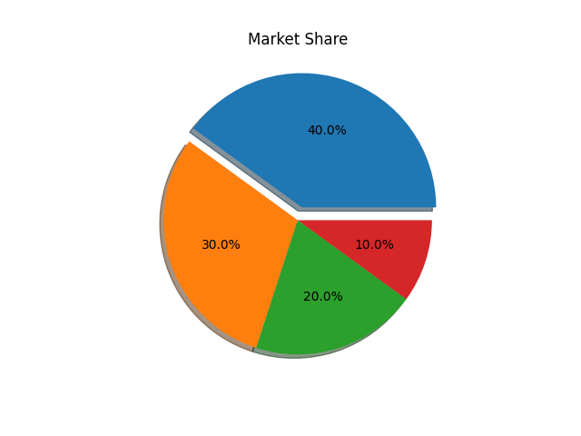
Adding Title
Python
import matplotlib.pyplot as plt values = [40, 30, 20, 10]labels = ["A", "B", "C", "D"]plt.pie(values, labels=labels) plt.title("Market Share") plt.show() # Output: # Pie chart with title

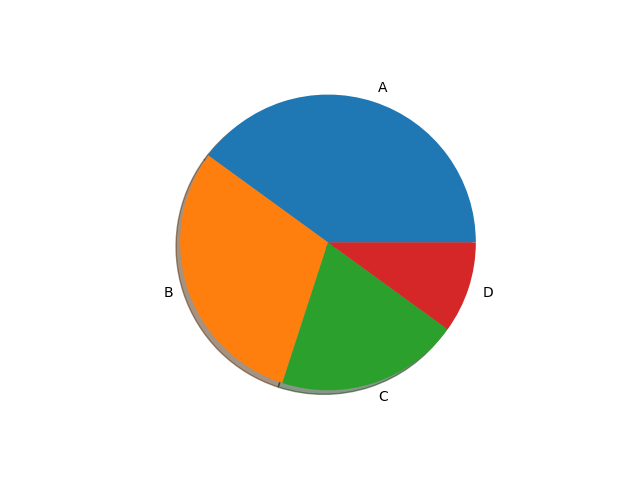
Pie Chart with Shadow
Python
import matplotlib.pyplot as plt values = [40, 30, 20, 10]labels = ["A", "B", "C", "D"]plt.pie(values, labels=labels, shadow=True) plt.show() # Output: # Pie chart with shadow effect
Combining Customizations
Python
import matplotlib.pyplot as plt values = [40, 30, 20, 10] labels = ["A", "B", "C", "D"] plt.pie(values, labels=labels, colors=colors, autopct="%1.1f%%", explode=explode, shadow=True) plt.title("Market Share") plt.show() # Output: # Fully styled pie chart