What Is a Bar Chart in Matplotlib?
A bar chart is a graphical representation used to compare categories using rectangular bars.
Each bar’s height or length corresponds to a value, making it easy to compare differences between groups.
Bar charts are commonly used in business reports, surveys, and analytics dashboards.
Basic Vertical Bar Chart
Python
import matplotlib.pyplot as plt categories = ["A", "B", "C", "D"] values = [10, 15, 7, 12] plt.bar(categories, values) plt.show() # Output: # Vertical bar chart comparing categories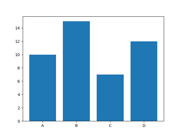
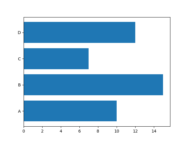
Horizontal Bar Chart
Python
import matplotlib.pyplot as plt categories = ["A", "B", "C", "D"] values = [10, 15, 7, 12] plt.barh(categories, values) plt.show() # Output: # Horizontal bar chartbarh() is useful when category names are long.
Changing Bar Colors
Python
import matplotlib.pyplot as plt categories = ["A", "B", "C", "D"] values = [10, 15, 7, 12] plt.bar(categories, values, color="green") plt.show() # Output: # Green colored bars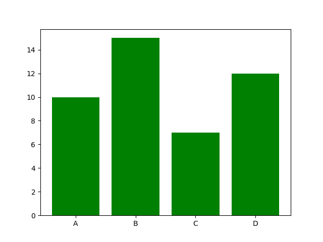
You can also use a list of colors:
Python
import matplotlib.pyplot as plt categories = ["A", "B", "C", "D"] values = [10, 15, 7, 12] colors = ["red", "blue", "green", "purple"] plt.bar(categories, values, color=colors) plt.show() # Output: # Bars with different colors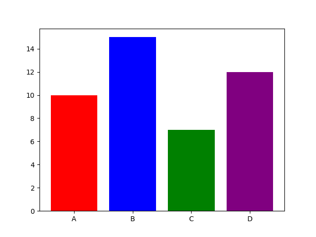
Adding Labels and Title
Python
import matplotlib.pyplot as plt categories = ["A", "B", "C", "D"] values = [10, 15, 7, 12] plt.bar(categories, values) plt.title("Sales Report") plt.xlabel("Products") plt.ylabel("Revenue") plt.show() # Output: # Bar chart with labels and title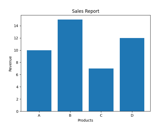
Adjusting Bar Width
Python
import matplotlib.pyplot as plt categories = ["A", "B", "C", "D"] values = [10, 15, 7, 12] plt.bar(categories, values, width=0.5) plt.show() # Output: # Narrower bars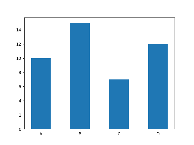
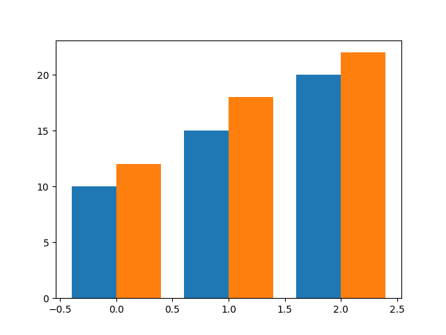
Multiple Bar Charts (Grouped Bars)
Python
import matplotlib.pyplot as plt import numpy as np x = np.arange(3) sales1 = [10, 15, 20] sales2 = [12, 18, 22] plt.bar(x - 0.2, sales1, width=0.4) plt.bar(x + 0.2, sales2, width=0.4) plt.show() # Output: # Two bar groups side by side