What Is a Line Plot in Matplotlib?
A line plot in Matplotlib is used to connect data points with straight lines.
It is one of the most common types of charts used to show trends over time, comparisons, or continuous data.
Line plots are created using the plot() function from the pyplot module.
Basic Line Plot Example
Python
import matplotlib.pyplot as plt x = [1, 2, 3, 4] y = [10, 20, 15, 25] plt.plot(x, y) plt.show() # Output: # A simple line chart connecting the points 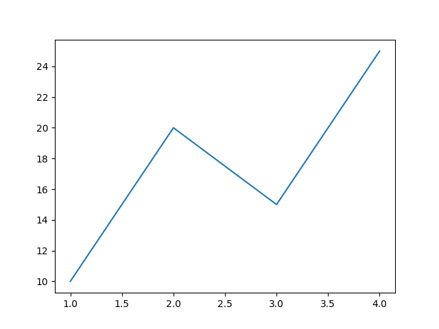
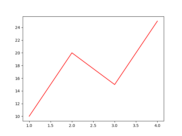
Changing Line Color
Python
import matplotlib.pyplot as plt x = [1, 2, 3, 4] y = [10, 20, 15, 25] plt.plot(x, y, color="red") plt.show() # Output: # Red colored line plot You can use colors like "blue", "green", "black", etc.
Changing Line Style
Python
import matplotlib.pyplot as plt x = [1, 2, 3, 4] y = [10, 20, 15, 25] plt.plot(x, y, linestyle="--") plt.show() # Output: # Dashed line plot 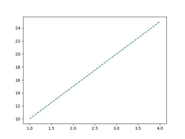
Common Line Styles
| Style | Description |
|---|---|
"-" | Solid line |
"--" | Dashed line |
":" | Dotted line |
"-." | Dash-dot line |
Changing Line Width
Python
import matplotlib.pyplot as plt x = [1, 2, 3, 4] y = [10, 20, 15, 25] plt.plot(x, y, linewidth=3) plt.show() # Output: # Thicker line plot 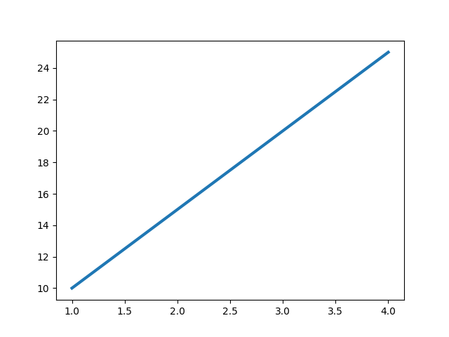
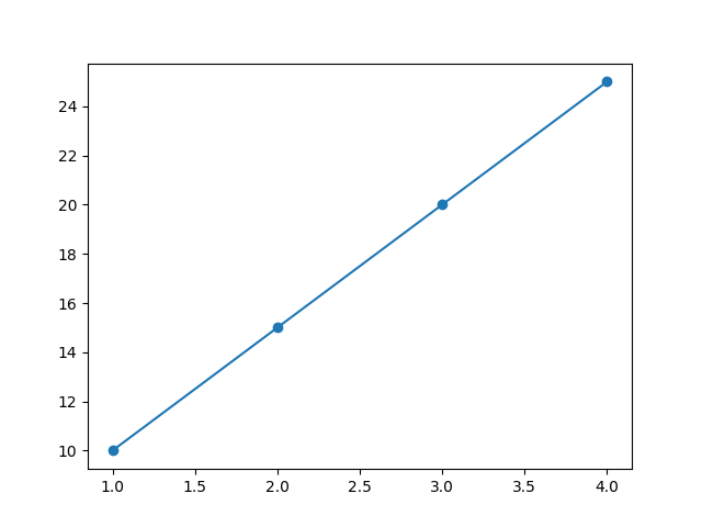
Adding Markers to Line
Python
import matplotlib.pyplot as plt x = [1, 2, 3, 4] y = [10, 20, 15, 25] plt.plot(x, y, marker="o") plt.show() # Output: # Line chart with circular markers Markers help highlight each data point.
Multiple Lines in One Plot
Python
import matplotlib.pyplot as plt x = [1, 2, 3, 4] y1 = [10, 20, 30, 40] y2 = [40, 30, 20, 10] plt.plot(x, y1) plt.plot(x, y2) plt.show() # Output: # Two line graphs in the same chart 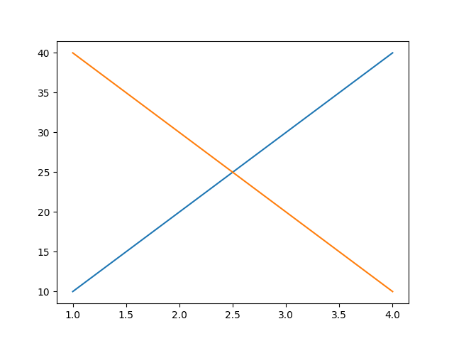
Adding Title and Labels
Python
import matplotlib.pyplot as plt x = [1, 2, 3, 4] y = [10, 20, 15, 25] plt.plot(x, y) plt.title("Monthly Sales") plt.xlabel("Month") plt.ylabel("Revenue") plt.show() # Output: # Line chart with title and axis labels 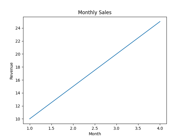
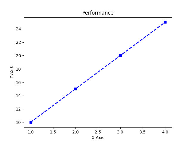
Combining Customizations
Python
import matplotlib.pyplot as plt x = [1, 2, 3, 4] y = [10, 20, 15, 25] plt.plot(x, y, color="blue", linestyle="--", linewidth=2, marker="s") plt.title("Performance") plt.xlabel("X Axis") plt.ylabel("Y Axis") plt.show() # Output: # Styled line plot with square markers and dashed blue line